The Passive House Network

Visual identity for a national nonprofit consolidating a distributed Passive House network under a clearer name and structure.
I engaged with the the team at The Passive House Network on a multi-phase collaboration to reimagine and structure their visual brand.
Summary
Sole designer and design lead for organizational brand identityStudio
MASS Design Group, Joelle RiffleCollaborators
Executive Director, Board of DirectorsDeliverables
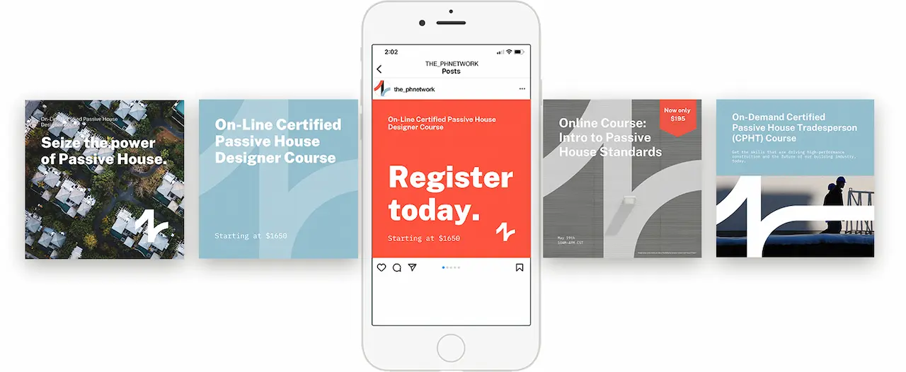
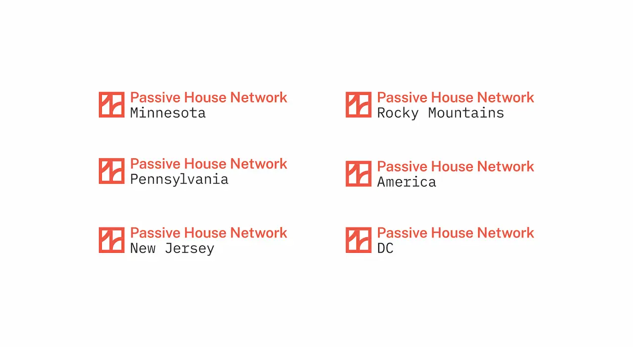
Organizational brand identity system, logo system, social media templates, and education program sub-brandingClient
The Passive House Network is a high-performance building literacy program, offering education on designing and constructing buildings that are efficient, comfortable, affordable, resilient, and healthy.- View the Project