Queer History Boston
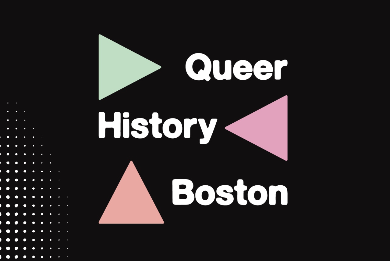
Visual identity for a community archive increasing visibility and public access through a name change.
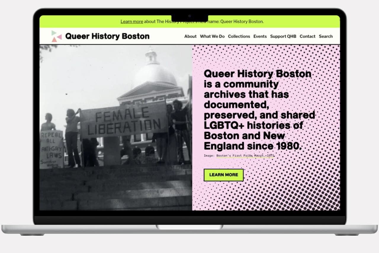
Queer History Boston (formerly The History Project) is one of the nation’s longest-running LGBTQ+ community archives. Founded in 1980, the organization documents, preserves, and shares the stories of queer and trans life in Boston and New England. The rebrand marks a public shift toward visibility and accessibility, introducing a name and visual system that reflect the energy, history, and community at the heart of its work.
Summary
Sole designer and design lead, responsible for brand identity and website from strategy through launchStudio
Joelle RiffleCollaborators
Executive Director, Director of Advancement ad EngagementDeliverables
Brand identity system, logo system, website design, and digital templates for ongoing organizational useClient
Queer History Boston is a community archives that has documented, preserved, and shared LGBTQ+ histories of Boston and New England since 1980.- View the Project