Branding and Website Design for AAPI Advocacy Organization

Asian Pacific Islanders Civic Action Network Branding and Web Design

A vibrant, unapologetic brand amplifying the voices of AAPI communities in Massachusetts.

Brief

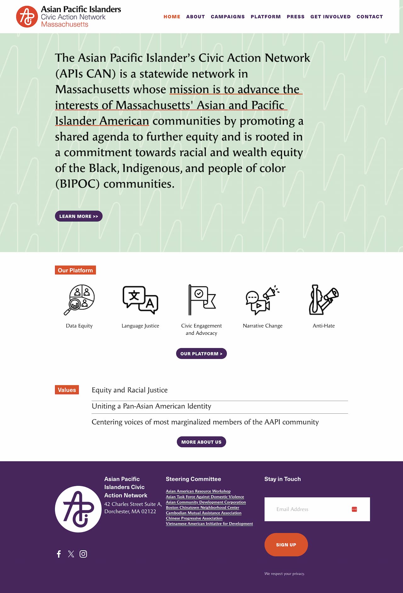
The goal was to create a cohesive brand and digital presence that reflects the dynamic, vocal, and action-oriented nature of APIs CAN while celebrating the diversity and nuance of its coalition.

  • Role

    Brand and Web Designer
  • Studio

    Joelle Riffle
  • Collaborators

  • Deliverables

    Brand Toolkit: Logo, typography, color palette, and brand guidelines Website: Squarespace design and build with CMS guide and training Templates: Canva designs for social media, reports, and documents
  • Client

    The Asian and Pacific Islanders Civic Action Network (APIs CAN) is a grassroots coalition dedicated to building political power and advancing systemic change for underrepresented Asian American and Pacific Islander communities. APIs CAN brings together a diverse range of voices—working-class, immigrant, and intersectional—to redefine the narrative of Asian Americans and fight for justice through bold, unapologetic activism.

Background
Since 2021, I’ve collaborated with the Leventhal Map & Education Center on all of their exhibitions, designing graphics that fit seamlessly into their curatorial process. Over time I’ve developed a strong understanding of their space, constraints, and audience. For Processing Place, I was responsible for the exhibition’s graphic identity—defining the look and feel, typography, color, patterns, and wall treatments.

Challenge
The exhibition presented a large collection of objects of varying sizes and formats, all of which needed to feel integrated within a single system. The curators wanted the show divided into clear sections, with recurring touchpoints that guided visitors between pre-digital and digital mapping practices.

The graphics had to work for visitors who read closely as well as those who skim. Housed in the historic, high-traffic Boston Public Library, the LMEC gallery requires every exhibition to be temporary and flexible. I turned those parameters into a system of adhesive grids and dimensional panels that delivers impact for visitors without sacrificing an immersive experience design.

Approach
I built the system around a grid, referencing both geospatial mapping and the pixel. That foundation connected directly to objects like the digitizing puck, once used to trace maps into GIS software. I filled squares with color to create headers, shadows, and emphasis, turning the grid into a flexible structure. For typography, I used a pixel-script font for titles and a monospaced computer face for object details, tying the graphics to the language of early computing.

I designed a highlighted annotation system to connect framed maps with their labels, making relationships clear at a glance. Adhesive wall labels with a grid background formed the base layer, while PVC-mounted reproductions added hierarchy and depth. To support different reading styles, I used solid-filled headers to mark each section, giving visitors a clear entry point whether they skimmed or read closely.

Outcome
The design broke down complex content into distinct, scannable sections while keeping a consistent thread through recurring graphic elements. Visitors could navigate at multiple levels, from quick overviews to detailed exploration. The curators confirmed the design matched their vision, and LMEC rehired me immediately for their next exhibition, Terrains of Independence—our sixth collaboration.

Reflection
The project achieved its core aim: turning dense content into graphics that felt approachable, structured, and engaging. The system proved effective within LMEC’s ongoing program, requiring no significant adjustments for future projects.

A monogram inspired by brush-inflected writing systems across Asian cultures, with clean geometric forms referencing traditional "chop" seals.


Vibrant shades of cinnabar red-orange, jade green, and community-focused orange, diverging from traditional red-centric designs while maintaining cultural resonance.


FF Angie Pro, a serif font with brush-inspired details, paired with clean sans-serif elements for accessibility and readability.


Flexible Canva templates for social media graphics, reports, and letterhead to support APIs CAN’s ongoing campaigns and communications.


A Squarespace site that serves as a clear, accessible resource for community members, offering information on platforms, campaigns, and resources. The design balances boldness and clarity, ensuring both visual appeal and functionality.

See the full project
See more 
Branding
 projects

Joelle Riffle