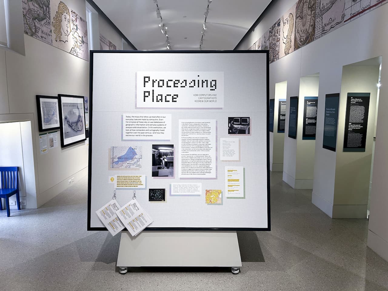
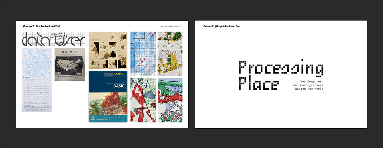
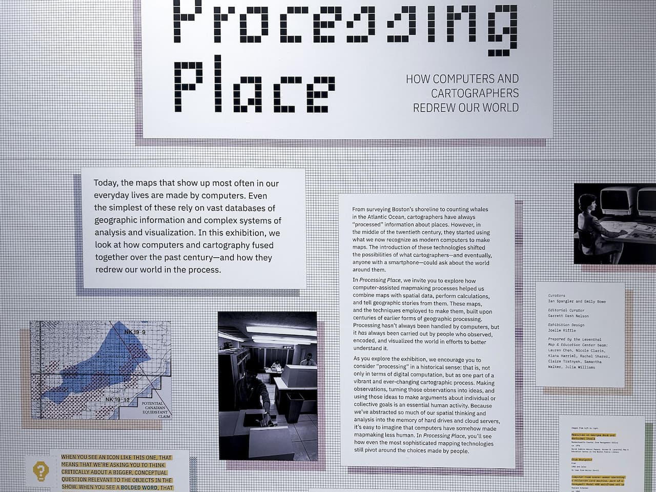
Processing Place: How Computers and Cartographers Redrew our World
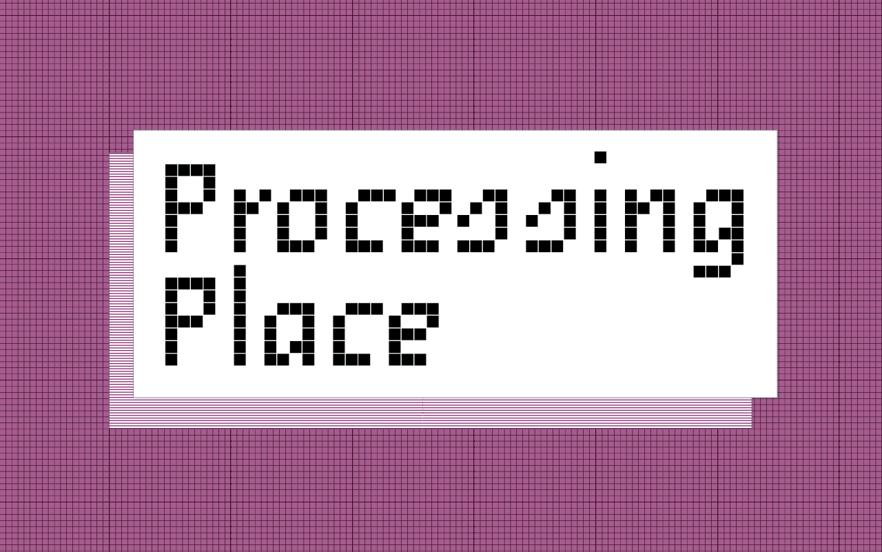
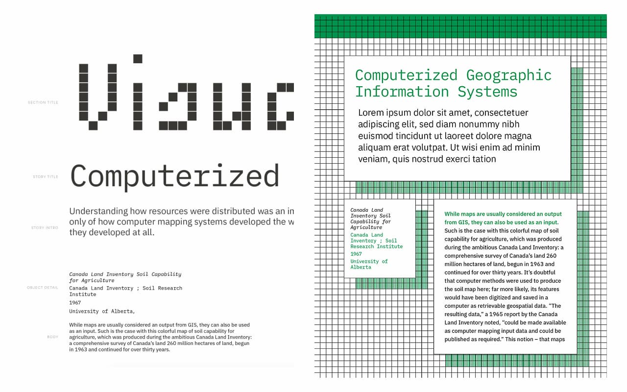
Exhibition graphics translating the tools of early digital cartography into a clear, approachable identity
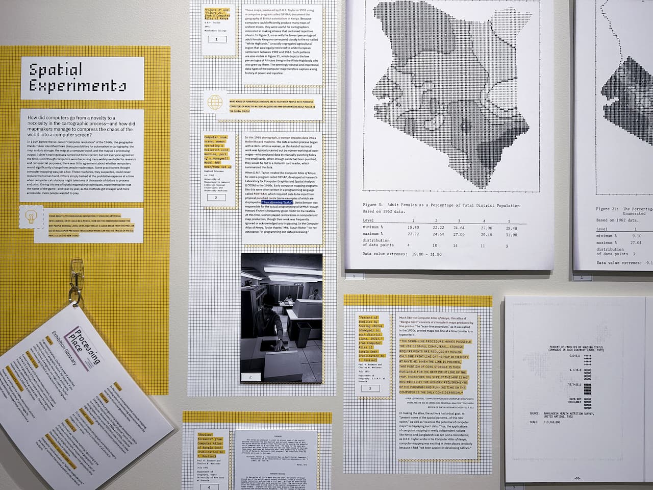
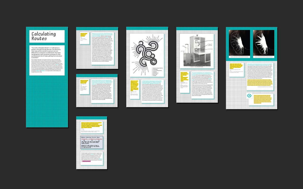
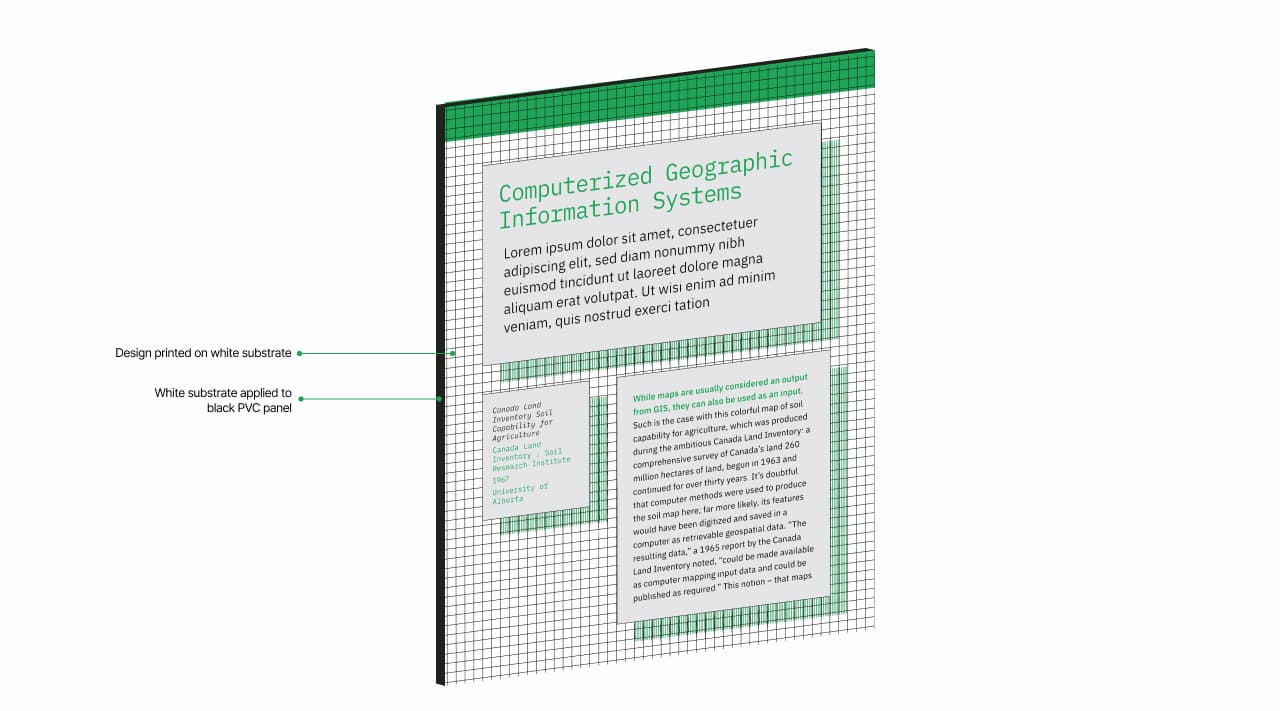
Design a flexible exhibition graphics system for Processing Place, exploring how computers and cartographers redrew our world. The project required a cohesive visual identity across diverse objects and dense content, balancing clarity, hierarchy, and approachability.
Summary
Sole designer and design lead for exhibition graphics and interpretive systemsStudio
Joelle RiffleCollaborators
Curators: Ian Spangler & Emily BoweDeliverables
Exhibition graphic system, interpretive labels, maps, timelines, and wayfindingClient
The Norman B. Leventhal Map & Education Center at the Boston Public Library is a public humanities organization that uses maps to inspire curiosity and learning. Through free collections, exhibitions, research, and education programs, the Center fosters geographic perspectives on the relationships between people and places.- View the Project