The Ellen Campus at the Dian Fossey Gorilla Fund

Exhibition design for a global conservation campus integrating research, education, and public interpretation
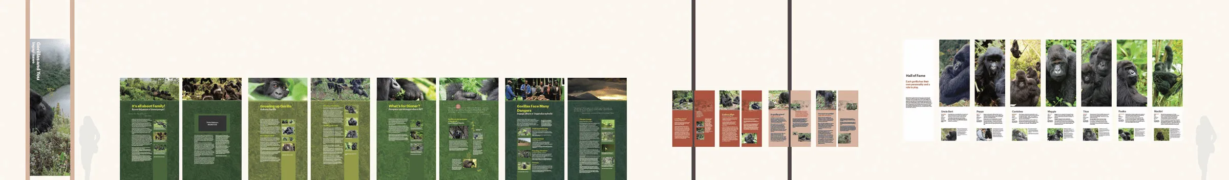
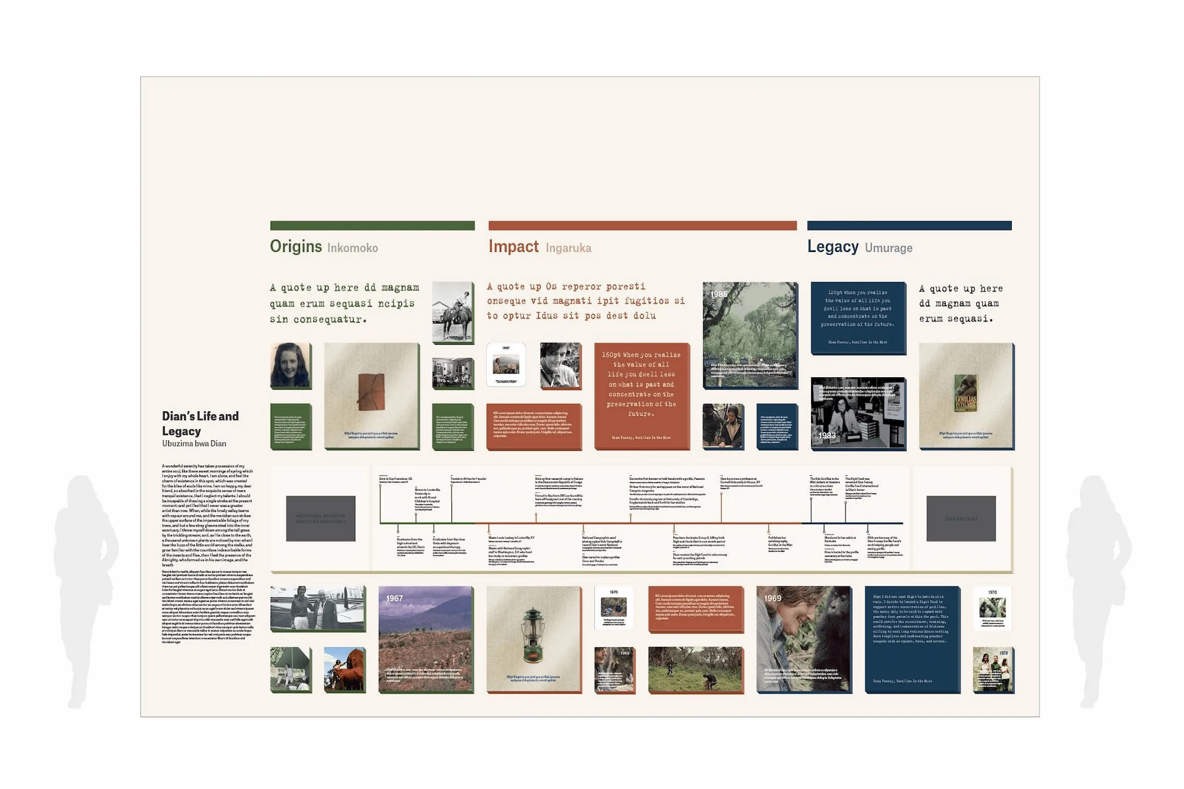
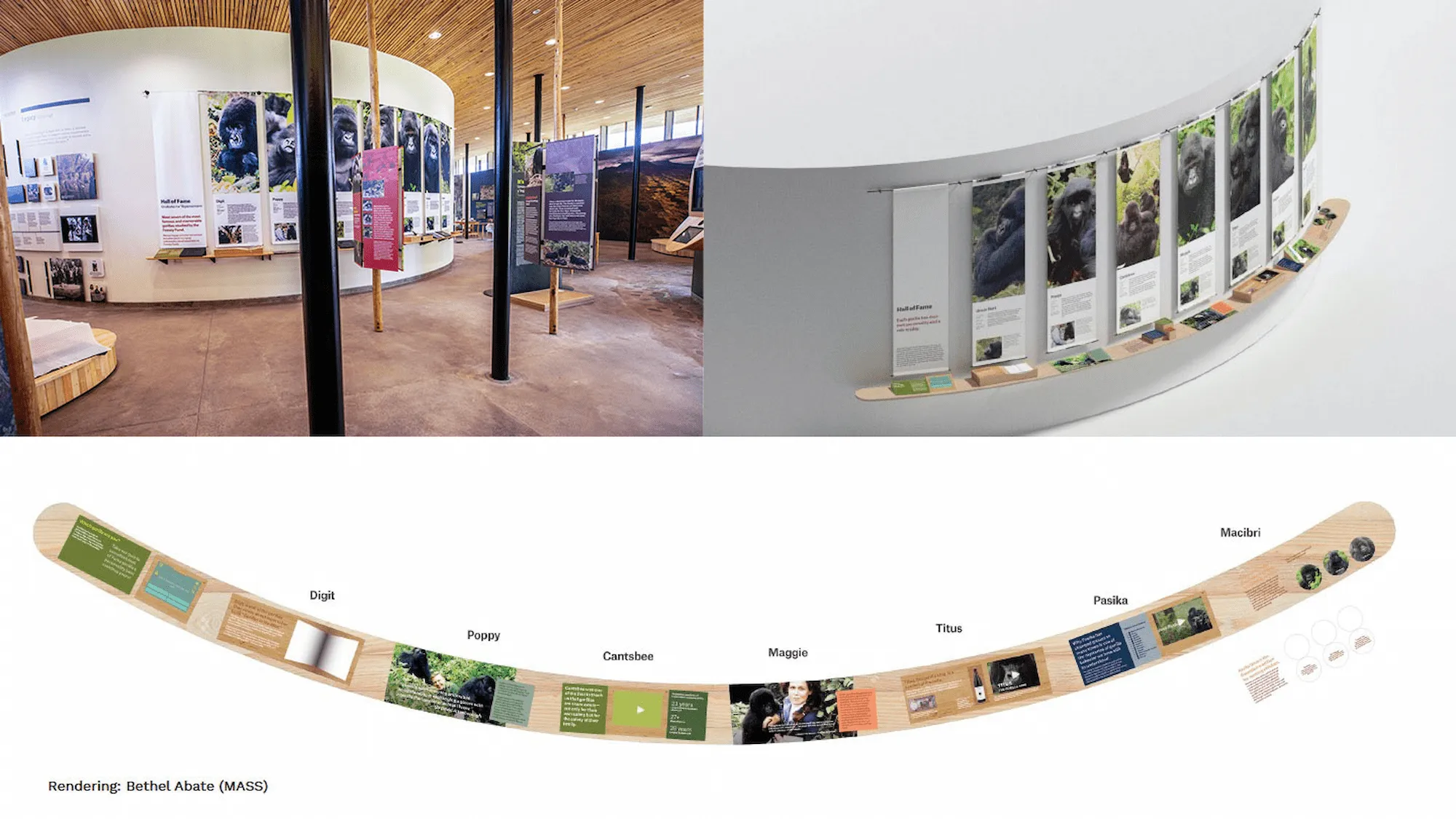
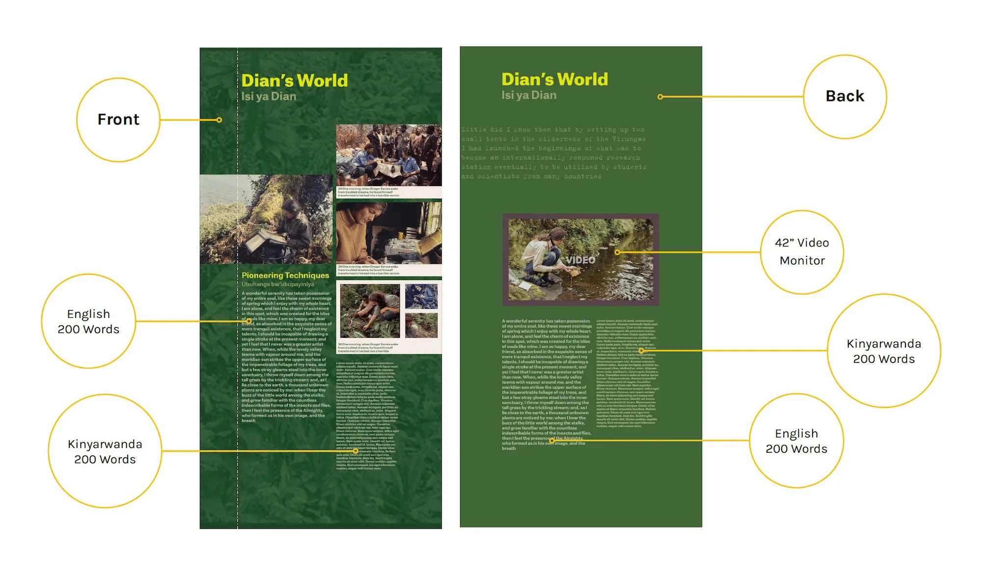
Exhibition graphic designer responsible for schematic and detailed design, translating and extending the established concept into a production-ready graphic system. Following the initial concept phase, I assumed ownership of the exhibition’s graphic system and carried it through development, production, and campus-wide application.
Summary
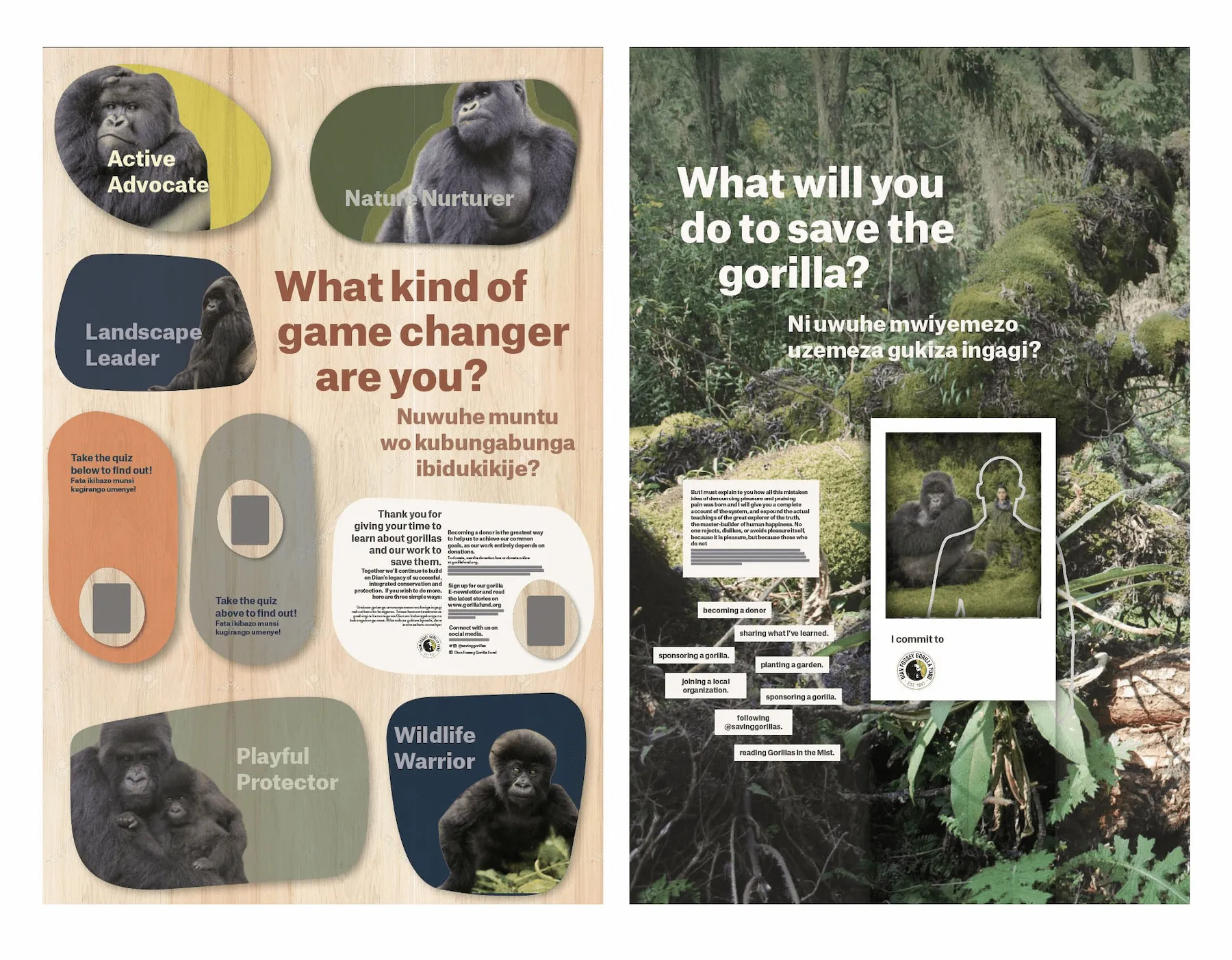
Exhibition graphic design for the Cindy Broder Conservation Gallery at the Ellen Degeneres Campus of the Dian Fossey FundStudio
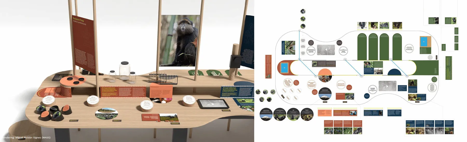
MASS Design GroupCollaborators
Exhibition concept: Local Projects; Graphic concept: Rick Valicenti and Anna Mort (THIRST); Exhibition design and visualization: MASS (Amie Shao, Emily Goldenberg, Maggie Jacobstein Stern, Bethel Abate, Miguel Roldán Signes)Deliverables
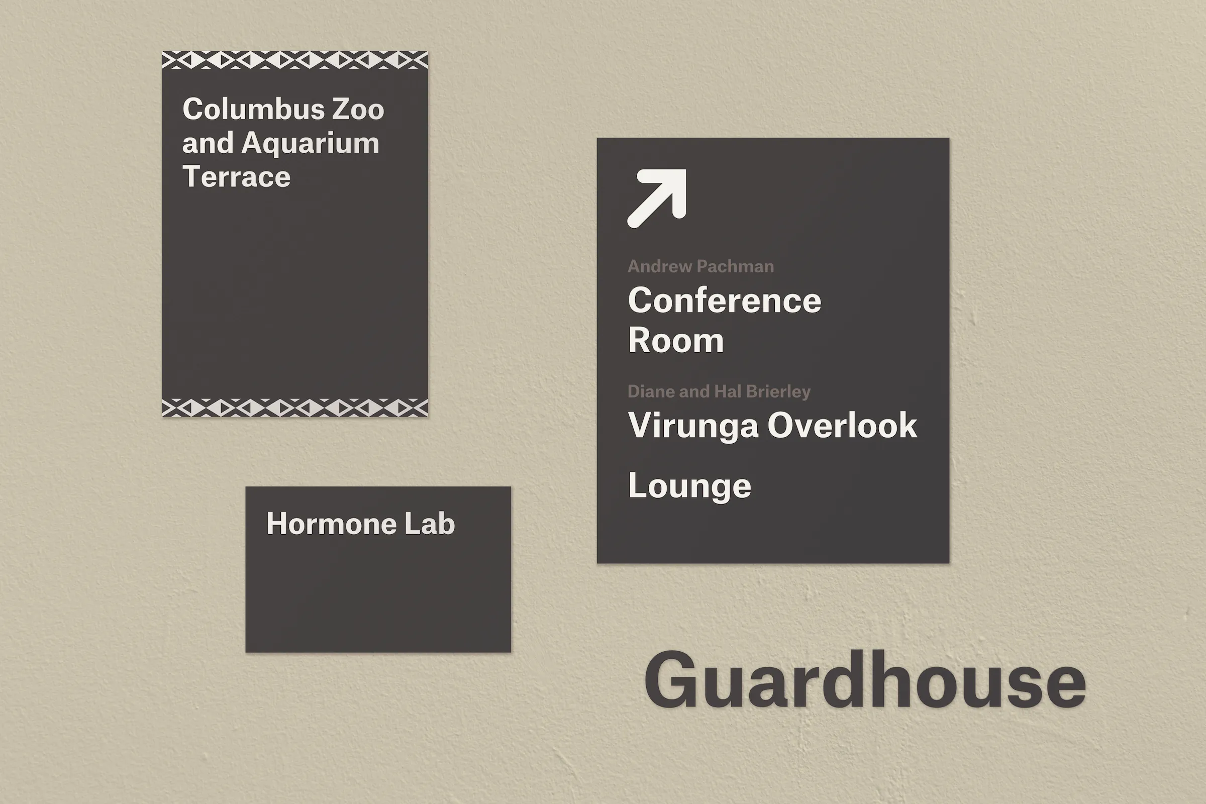
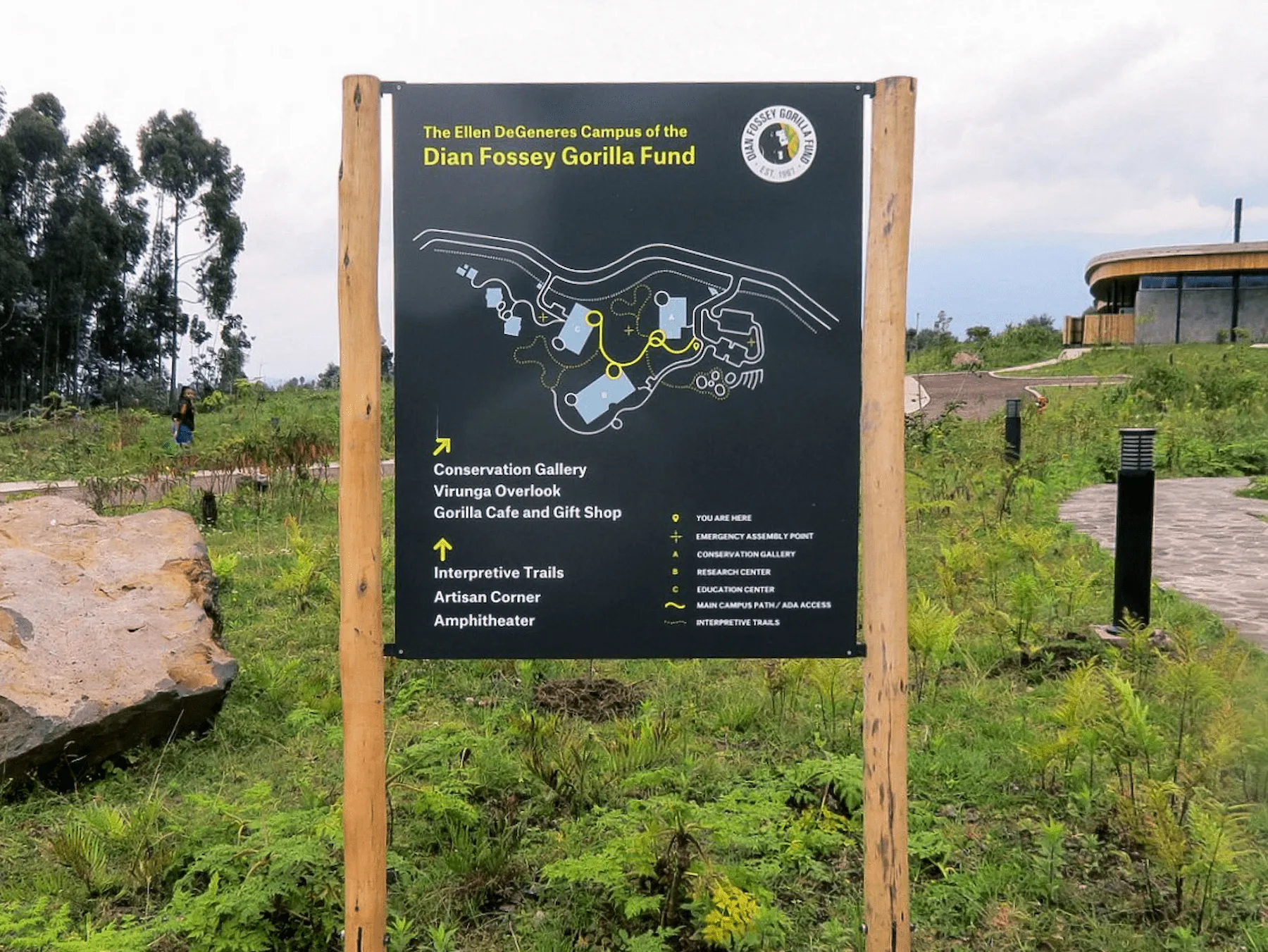
Schematic and detailed exhibition graphic design, applying and extending the established visual system across exhibition, signage, and environmental contexts.Client
The Ellen DeGeneres Campus of the Dian Fossey Gorilla Fund is a center for gorilla conservation and scientific research in Rwanda.- View the Project