VOCAL-NY

A brand identity for a growing community organizing, advocacy, and direct services organization
With the organizations existing skyline logo as a springboard, design a visual brand representing the work of the grassroots community organization.
Summary
Design lead for organizational brand system and communicationsStudio
Joelle RiffleCollaborators
Director of CommunicationsDeliverables
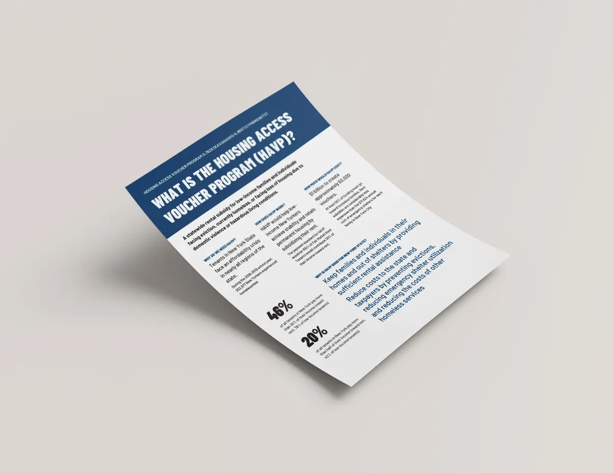
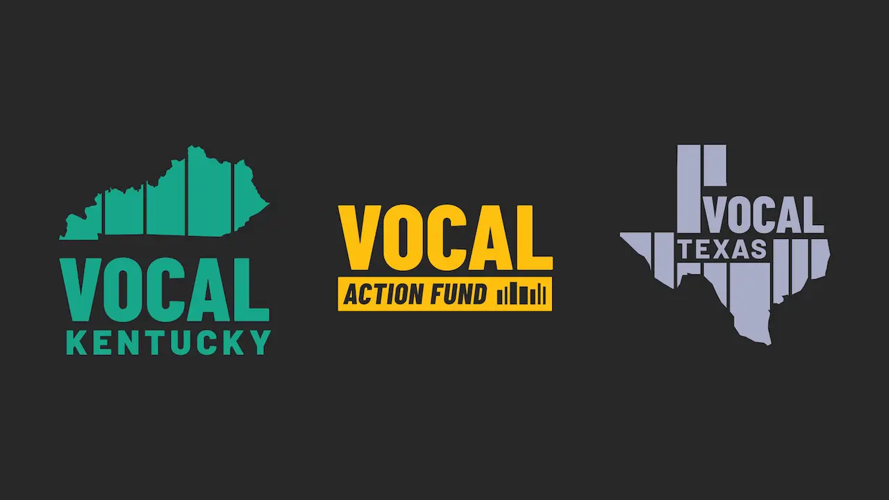
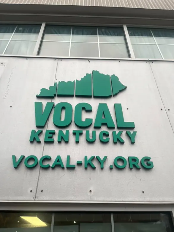
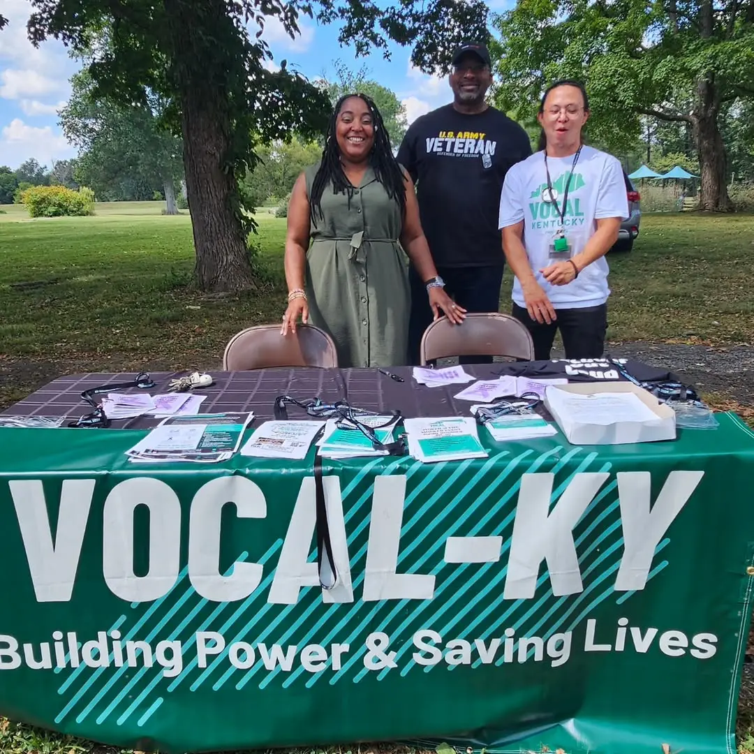
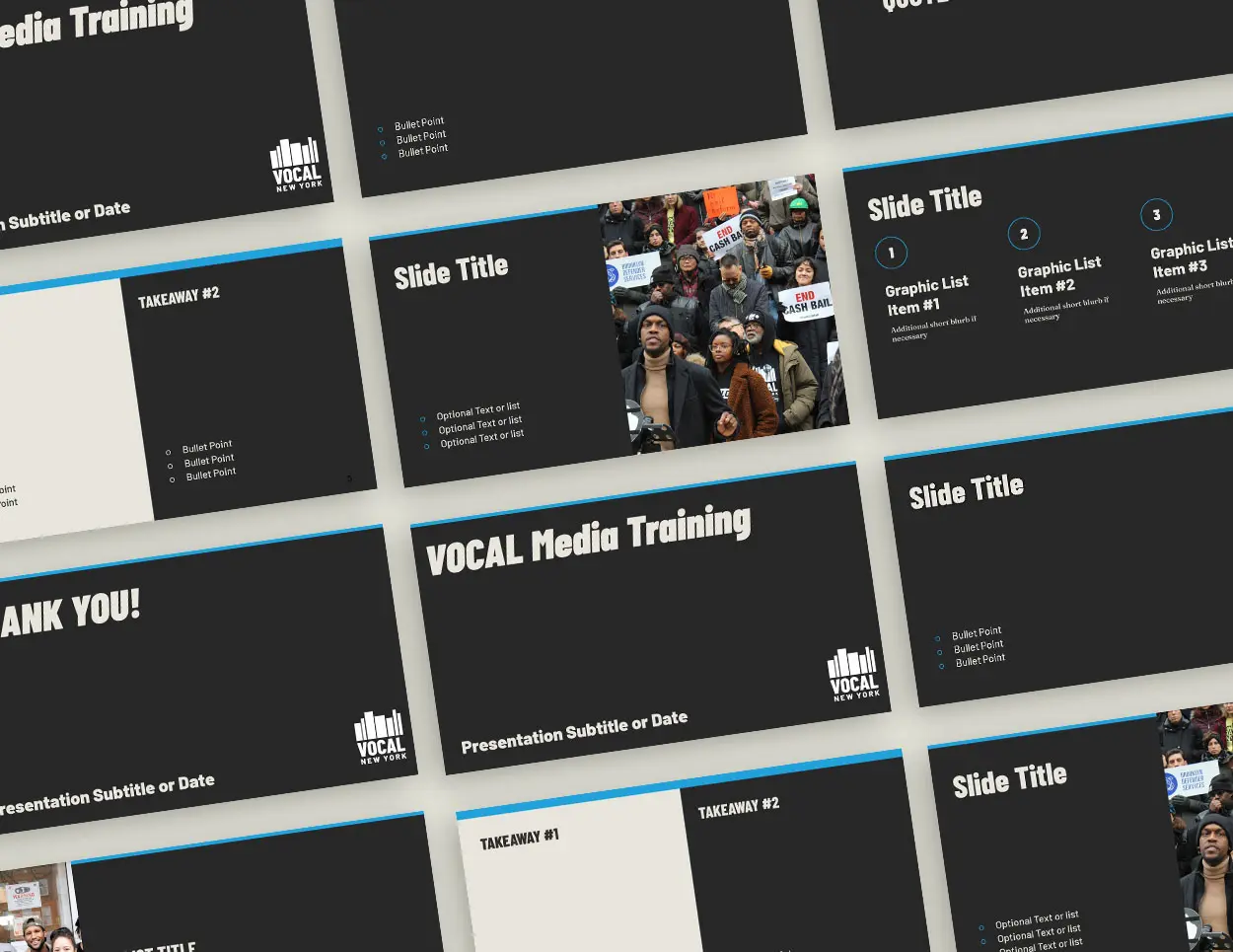
Organizational brand guidelines, outreach materials, chapter-level brand adaptations, and annual report designClient
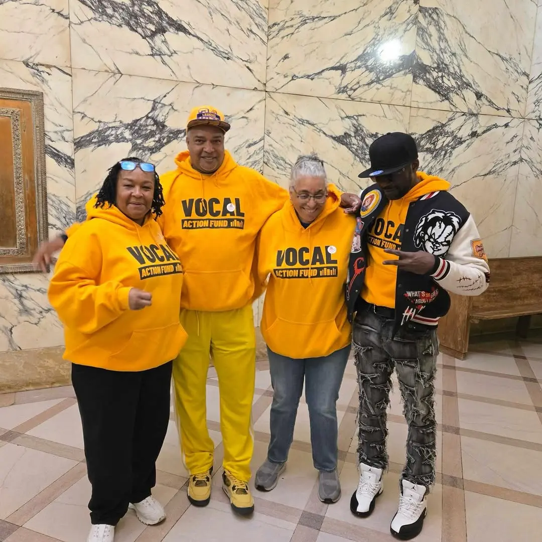
Voices of Community Activists and Leaders (VOCAL-NY) is a statewide grassroots membership organization that builds power among low-income people directly impacted by HIV/AIDS, the drug war, mass incarceration, and homelessness. Since beginning our collaboration, sister organizations VOCAL Kentucky and the VOCAL Action Fund have since launched.- View the Project