How We Take Up Space: Memories, Stories, and Poems on Spatial Justice

A book about memory, place, and belonging, designed to hold the voices of women reflecting on Boston’s public spaces.
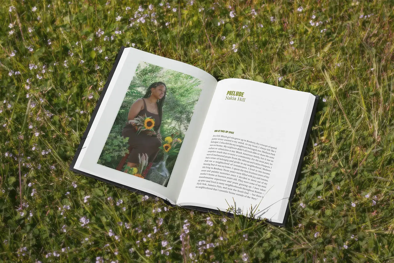
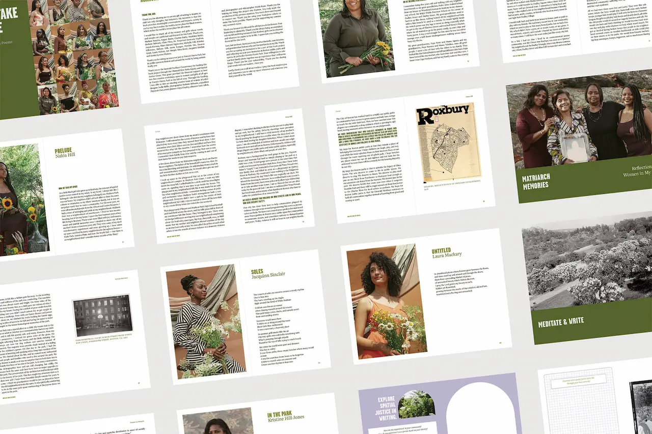
Rooted in Boston’s parks and neighborhoods, How We Take Up Space gathers poems, essays, and memories from women and girls reflecting on belonging, safety, and public space. Designed in collaboration with author Nakia Hill, the book combines portraits, archival materials, and layered textures to echo its themes of memory and reclamation. Produced through Hill’s community writing workshops at Horatio Harris Park, the project was supported by the Emerald Necklace Conservancy’s Olmsted Now Parks Equity and Spatial Justice Grant.
Summary
Publication Designer and Graphic Creative DirectorStudio
Joelle RiffleCollaborators
Stefanie Belnavis: Lead Photographer; Nakia Hill: Book Project Director Nickii Kane: Photographer & Videographer; Zipporah Osei: Copyeditor Joelle Riffle: Designer; Donna Snow: Photoshoot AssistantDeliverables
Interior and cover design Creative direction for publication Full publication design and productionClient
Nakia Hill is an author and self book publisher of three books including two intergenerational anthologies uplifting the voices of women.- View the Project