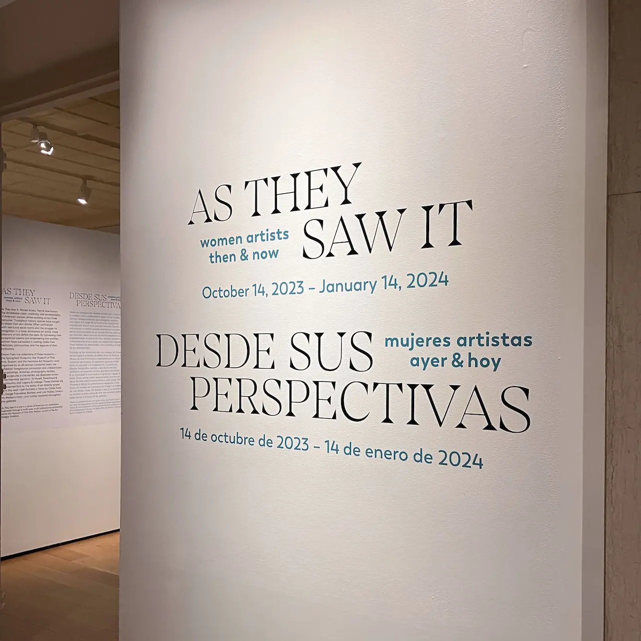
As They Saw it: Women Artists Then & Now

Exhibition identity for a multi-institutional show connecting women artists across three centuries.
This project required an exhibition design that elevated the themes of women’s creativity and resilience while addressing the logistical needs of two distinct museum settings.
Summary
Sole designer and design lead for exhibition brand identity and interpretive graphicsStudio
Joelle RiffleCollaborators
This exhibition was co-curated by Martina Tanga and Erica Hirshler, Museum of Fine Arts, Boston, Maggie North and Sophie Combs, Springfield Museums; and Ann Cannon and Julia Madore, Fenimore Art Museum.Deliverables
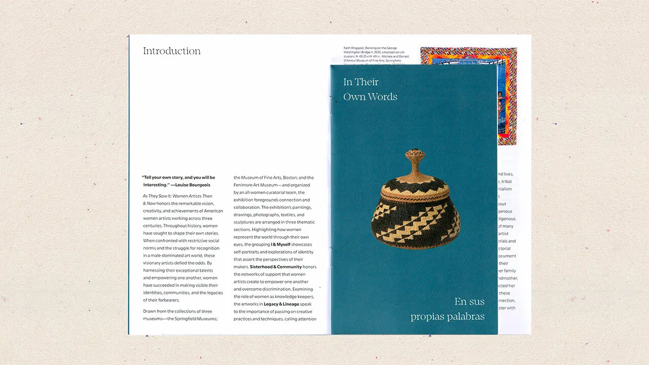
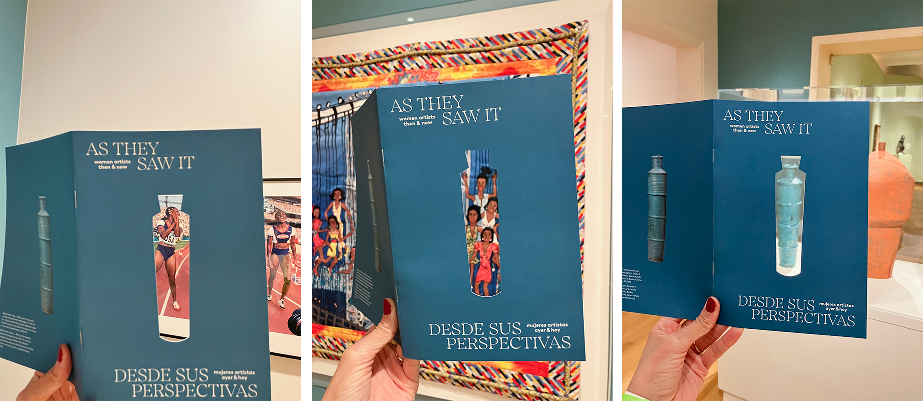
Exhibition brand identity, interpretive label system (bilingual), title wall design, and exhibition brochureClient
The MFA has shared works from its collection with four partner museums across the Northeast as part of the Art Bridges Initiative. This program by the Art Bridges Foundation builds on its mission to expand access to American art across the United States.- View the Project