Brief
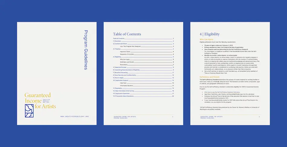
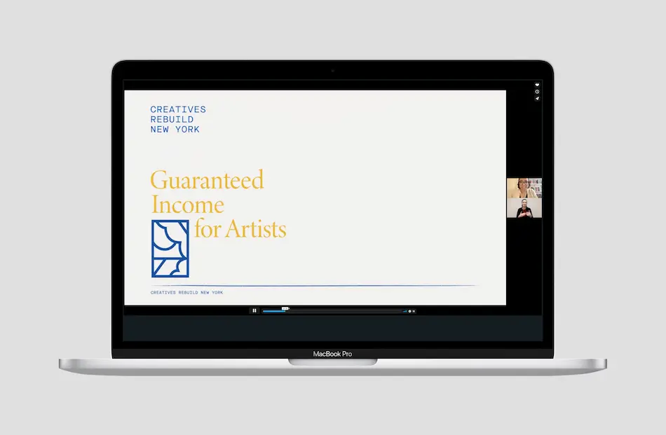
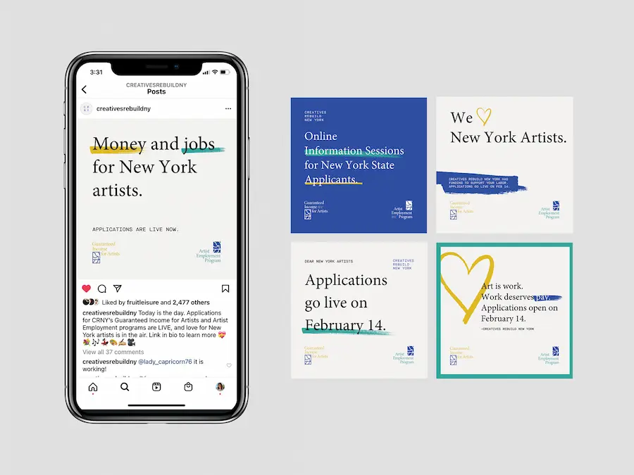
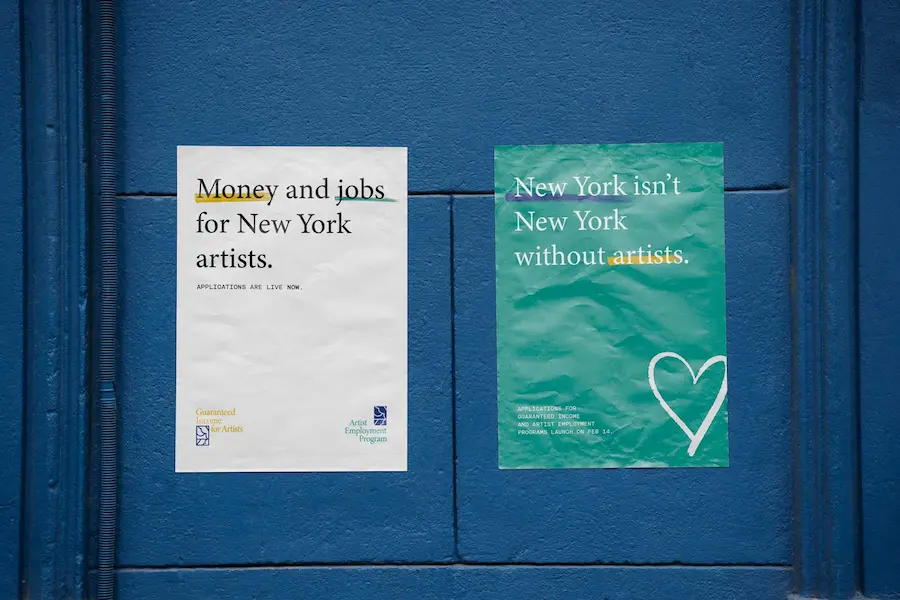
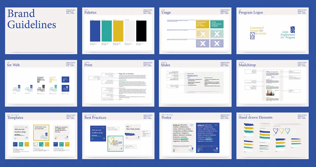
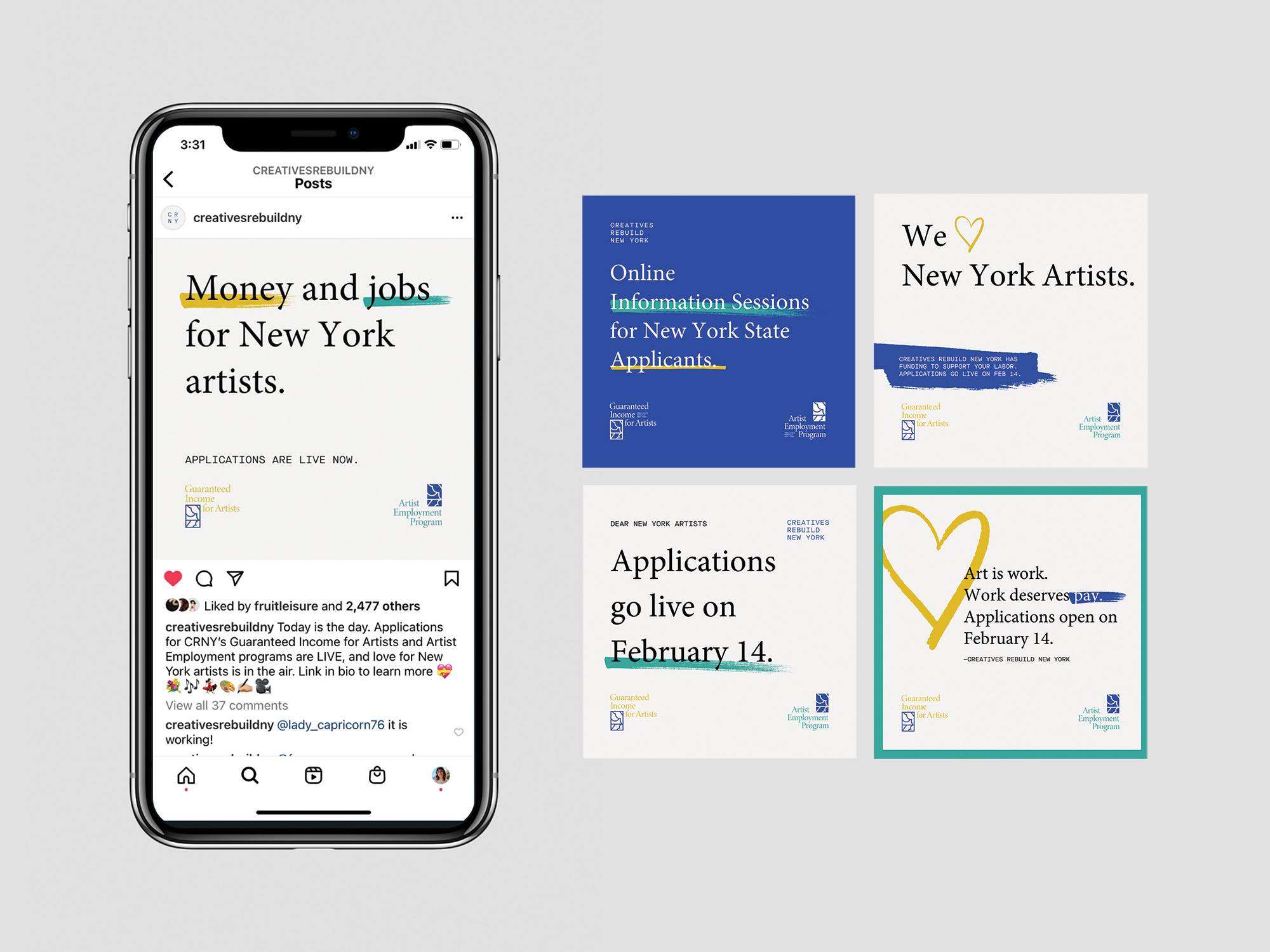
Creatives Rebuild New York launched two projects to fund artists and their work, the Artists Employment Program and Guaranteed Income for Artists. I worked alongside their team to design two parallel brands and materials in advance of the application period for both projects opening in spring 2022.
Role
Studio
Collaborators
Deliverables
Client
Background
Since 2021, I’ve collaborated with the Leventhal Map & Education Center on all of their exhibitions, designing graphics that fit seamlessly into their curatorial process. Over time I’ve developed a strong understanding of their space, constraints, and audience. For Processing Place, I was responsible for the exhibition’s graphic identity—defining the look and feel, typography, color, patterns, and wall treatments.
Challenge
The exhibition presented a large collection of objects of varying sizes and formats, all of which needed to feel integrated within a single system. The curators wanted the show divided into clear sections, with recurring touchpoints that guided visitors between pre-digital and digital mapping practices.
The graphics had to work for visitors who read closely as well as those who skim. Housed in the historic, high-traffic Boston Public Library, the LMEC gallery requires every exhibition to be temporary and flexible. I turned those parameters into a system of adhesive grids and dimensional panels that delivers impact for visitors without sacrificing an immersive experience design.
Approach
I built the system around a grid, referencing both geospatial mapping and the pixel. That foundation connected directly to objects like the digitizing puck, once used to trace maps into GIS software. I filled squares with color to create headers, shadows, and emphasis, turning the grid into a flexible structure. For typography, I used a pixel-script font for titles and a monospaced computer face for object details, tying the graphics to the language of early computing.
I designed a highlighted annotation system to connect framed maps with their labels, making relationships clear at a glance. Adhesive wall labels with a grid background formed the base layer, while PVC-mounted reproductions added hierarchy and depth. To support different reading styles, I used solid-filled headers to mark each section, giving visitors a clear entry point whether they skimmed or read closely.
Outcome
The design broke down complex content into distinct, scannable sections while keeping a consistent thread through recurring graphic elements. Visitors could navigate at multiple levels, from quick overviews to detailed exploration. The curators confirmed the design matched their vision, and LMEC rehired me immediately for their next exhibition, Terrains of Independence—our sixth collaboration.
The logomark references the work of Ellsworth Ausby, an African American artist whose work was supported by the Comprehensive Employment and Training Act (CETA), a predecessor to CRNY’s Artists Employment Program.
The brand identity encompasses all the materials the organization need to begin outreach — social media and poster templates, decks for information sessions, and document templates. Now, more than 500 artists and 115 organizations have participated in the two programs.