Brochure Design for Art Gallery

Boston Center for the Arts 1:1 Foldout Poster Design

A poster design offers portals into artists work for exhibition series at a Boston gallery

Brief

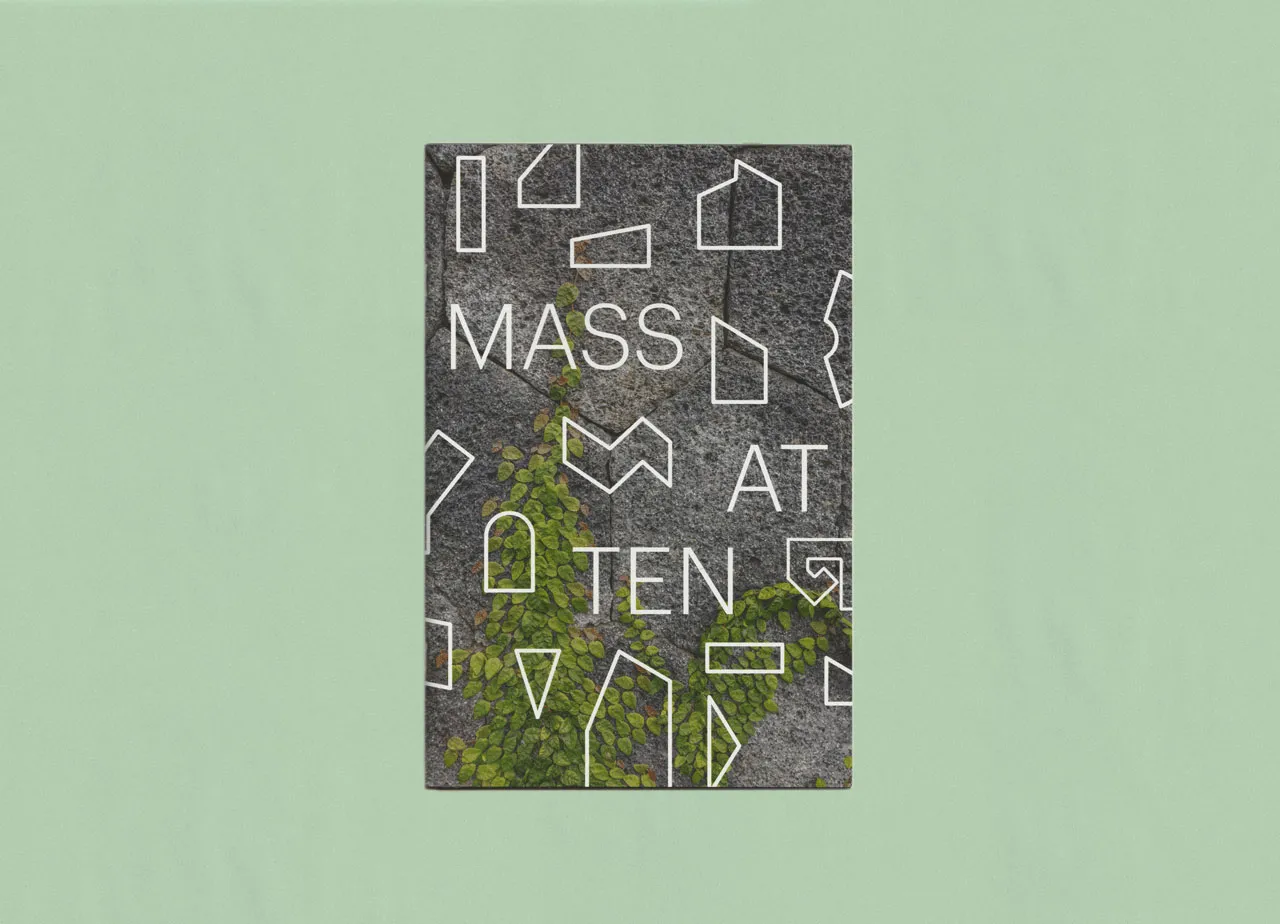
Chosen as the BCA 2022-2023 guest graphic designer for the 1:1 Mills Gallery series, I designed a series of four posters featuring portals, windows, or frames into each of the featured artists’ work.

  • Role

    Brochure Design for Art Gallery
  • Studio

    Joelle Riffle
  • Collaborators

  • Deliverables

    Four fold-out poster/ brochure series
  • Client

    The Boston Center for the Arts is a hub for visual and performing arts in Boston, located in the South End. The 1:1 exhibition series pairs one curator and one artist for shows in their Mills Gallery.

Background
Since 2021, I’ve collaborated with the Leventhal Map & Education Center on all of their exhibitions, designing graphics that fit seamlessly into their curatorial process. Over time I’ve developed a strong understanding of their space, constraints, and audience. For Processing Place, I was responsible for the exhibition’s graphic identity—defining the look and feel, typography, color, patterns, and wall treatments.

Challenge
The exhibition presented a large collection of objects of varying sizes and formats, all of which needed to feel integrated within a single system. The curators wanted the show divided into clear sections, with recurring touchpoints that guided visitors between pre-digital and digital mapping practices.

The graphics had to work for visitors who read closely as well as those who skim. Housed in the historic, high-traffic Boston Public Library, the LMEC gallery requires every exhibition to be temporary and flexible. I turned those parameters into a system of adhesive grids and dimensional panels that delivers impact for visitors without sacrificing an immersive experience design.

Approach
I built the system around a grid, referencing both geospatial mapping and the pixel. That foundation connected directly to objects like the digitizing puck, once used to trace maps into GIS software. I filled squares with color to create headers, shadows, and emphasis, turning the grid into a flexible structure. For typography, I used a pixel-script font for titles and a monospaced computer face for object details, tying the graphics to the language of early computing.

I designed a highlighted annotation system to connect framed maps with their labels, making relationships clear at a glance. Adhesive wall labels with a grid background formed the base layer, while PVC-mounted reproductions added hierarchy and depth. To support different reading styles, I used solid-filled headers to mark each section, giving visitors a clear entry point whether they skimmed or read closely.

Outcome
The design broke down complex content into distinct, scannable sections while keeping a consistent thread through recurring graphic elements. Visitors could navigate at multiple levels, from quick overviews to detailed exploration. The curators confirmed the design matched their vision, and LMEC rehired me immediately for their next exhibition, Terrains of Independence—our sixth collaboration.

Reflection
The project achieved its core aim: turning dense content into graphics that felt approachable, structured, and engaging. The system proved effective within LMEC’s ongoing program, requiring no significant adjustments for future projects.

Each cover uses the same overall structure while the typography, color, paper stock, and graphic motifs shift.

The brochure folds out to reveal a poster.

The series’ concept of portals and frames around the use of architecture and public space in Anukriti’s pieces.

Brooke Stewart incorporates elements relevant to her portrait sitters work and life in the paper on which she prints her work. I suggest samples of the paper and portraits in the poster for her show.

Cedric Harper uses a signature heavyweight stencil font as text throughout his work.

Inspired by the nets and camouflage concepts used in Mimi Bai’s Hide and See show.

See the full project
See more 
Print Design
 projects

Joelle Riffle